
Airbnb's activism site, “until we all belong” is a digital promotional endeavor intended for accruing support of marriage equality. This Australian site encourages visitors to purchase a specific ring and wear it until the LGBTQ received the right to marry.
The construction of the site is focused on moving the product and immersively evoking the values of the experience. What’s interesting about this site is, at its core, its function is very singular. It’s trying to create a very specific UX, that being the sales of the ring. This simple homepage is designed in such a way that the mission of the site is foregrounded beyond corporate brand.
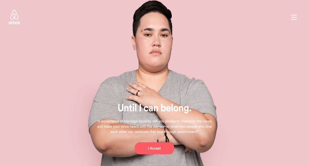
For all intents and purposes, the site doesn't much appear to belong to Airbnb, besides the logo in the top left. The site design is hardwired to focus on the social endeavor that the site represents. By designing a homepage that focuses on drawing attention to the ring and the ring’s message, users are fully kept in the confines of the intended experience.
-desktop.jpg)
This product page continues the practice of using design to focus the UX on the intention of the ring. The ring is magnified ten-fold and dynamically lit. The text and branding is minimal and out of the way, so all users have to witness is the magnanimity of the product and its associated purpose.
Airbnb created this site because they understand the importance of what they're doing and how it transcends any one person or business. This page is stripped back but dynamic design compliments this state of mind impeccably. What’s more, the purchase button has been changed to say, “accept”, again enhancing the conscious image of the site. By strategically altering the text and function of the site to minimize business and maximize humanity, the design is again meeting the site’s brand expectations.
The user concludes the site by continuing the same structure, function, and look of the rest of the site. Interestingly, this page is another product page, and is geared towards selling the ring. But that's the thing, you wouldn't think that at face value. That's because the page is designed to specifically to create a genuinely conscious experience for users. It's difficult to detect the intention of this page beyond its message of equality, and that speaks to the effectiveness of the UX web design.
Until We All Belong is a minimal website design in the Non-Profit industry.


