
Thrive Market’s Colorful Packaging Catches Consumer Eyes With Ease
Thrive Market is an organic and all-natural online grocery shop and food subscription service that’s passionate about connecting people with affordable, ethically sourced and natural ingredients and meals. It’s a brand with a heart and a passion for a healthy life and a healthy mind — easing consumers’ weekly grocery shopping worries by providing them with the food that will help them live their best lives.
And its creative packaging matches that.
Here’s the brand’s story:
We used to know where our food came from and what was in it. Somewhere along the way, that got lost. But grocery shopping doesn’t need to be a to-do list or a research project. And it shouldn’t be an ethical dilemma or a budget-breaker either. We started Thrive Market because we knew what food could be: made of real ingredients, kind to the environment, reasonably priced, catered to our needs, and delicious. Thrive Market is what food used to be, the food we’d been looking for all along. Picked by values, priced without unnecessary layers, and delivered to you for free.
And to excite and entice its subscribers, the brand plays with clever packaging in order to enlighten and inspire. The brand knows that going all-natural can sometimes feel like a foreign act.
It can be challenging and alarming — so the brand wants to change perceptions, and it does so through design.
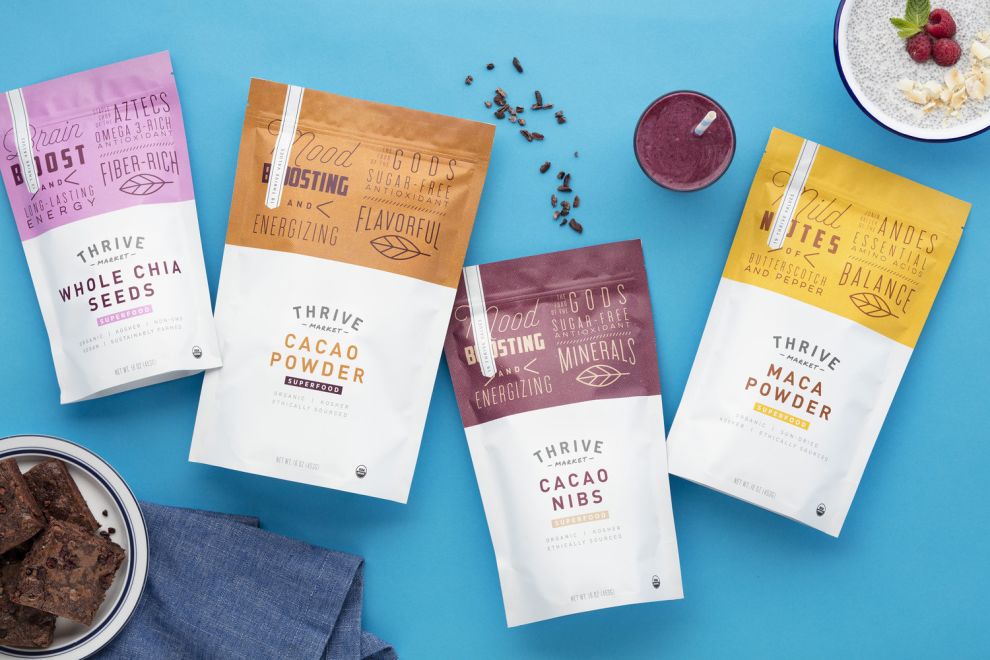
You can see it in the colors used in its superfood pouch packages. These designs are bright, vivid and fun — highlighting the benefits of the superfood in an engaging way that takes out the overly-scientific explanations and overview.
The top third of these designs are coated in a matte coloring — from purple to red and beyond. These bright colors instantly grab attention and attract eyes, making these products jump from the online shelves and into consumer shopping carts.
Each superfood gets its own clever and colorful personality, and it helps to bring an air of excitement to these superfoods that isn’t always apparent. Of course we know we should eat healthy, and of course we know superfoods are good for us but that doesn’t mean we’re excited about it.
But these colors inspire excitement in creative ways.
This color is seen as the background of the design itself, but it’s also seen in the playful typography and imagery the sits on the packaging. And it gives these products a personality that can’t be denied.
Do you love colorful designs? Check out our Best Print Design section for more inspiration!
Thrive Market’s Superfood Packaging Informs And Inspires With A Clean And Clear Design
Color plays a powerful role in these packaging designs, but they aren’t the only stars of the show. And what connects all of these creative and engaging elements is the overall layout and orientation — one that is clean, clear and concise.
Health food products rarely have packaging that makes you think, “I bet that tastes great!” Thrive Market’s Organic Superfoods products aimed to change the feeling that shoppers get when they see a healthy product based on organic superfoods.
The product packaging is clean, colorful and eye-catching. The top of each bag is brilliantly bright, with unique typography inside to exhibit the properties of each food. Despite the varying typeface on each bag, they still look very clean and organized. It doesn’t feel like the eye has to jump all over the place to take in the design.
The bold, vibrant top third of the packaging quickly morphs into a simple, white design. The typography is much cleaner and more organized on the bottom half of the container. It almost feels as if this design has two totally different personalities. The top is fun and a little wild. The bottom is plain, intended to just give you the facts. The contrasting result is very appealing to view on a grocery shelf.
On the back side, there is a lot more information, including nutritional facts and recipe ideas. All of this textual content is important to health-conscious shoppers, so it was essential to include it on the product packaging.
Ultimately, Thrive Market did a great job creating a clean design that looks appealing, while still offering enough information for consumers to make an informed buying decision. They were careful to avoid allowing too much information to crowd the front portion of the package that consumers initially see. This bold, clean design is a breath of fresh air in a market that can feel a little boring and bland.
This clean design leads users on a quick journey into superfood enlightenment — and they come out changed on the other side.

This Packaging Plays With Typography To Jump Off The Shelves
Color and layout lead consumers to the product and its message, but it’s the typography that really drives the point home.
There are a variety of different fonts and sizes used in this design, and they’re interspersed with cool and crafty imagery that jumps from the pouch. This typography is flowing and smooth, capturing a nostalgic and old-school candy shop vibe. But in other instances it’s strong and powerful — providing consumers with valuable information in a way that exudes authority and authenticity.
The typography is also vital in conveying the powerful information behind these superfood products and why they’re important.
On the surface, this typography is fun and light, but it sucks consumers in and informs on a deeper level, working to change consumer perceptions about superfoods and health products. They don’t have to be bland, boring and unappetizing. They can be fun and cool and delicious too!
This typography works as an exciting design element that compels, but quickly leads consumers on an educational journey that helps them to see superfoods and health food products in general in a whole new light.
Going with multiple fonts and sizes can sometimes be distracting. It can be seen as jarring and overly complicated and disorganized. It can also be seen as sloppy — like the brand can’t decide who it wants to be, but here it works.
Great packaging understands its audience, and the packaging included in out Best Package Design section certainly do just that!

Thrive Market’s Packaging Emphasizes The Brand’s Dedication To All-Natural And Organic Ingredients
A lot of brands talk the talk, but they can’t walk the walk. But with Thrive market, you have an example of a brand that can do both. It can encourage consumers to lead a more healthy, happy lifestyle and promote the providers and distributors that can give it to them.
Best of all, they do it affordably and sustainably.
Here are some insights into the brand’s core mission from Thrive Market itself:
We’re simplifying the supply chain to get you the products you value for an actual value. That means an average savings of $30 on every order. And if you don’t make back your whole membership in savings? We’ll refund you the difference, no questions asked. You don’t need to research the brands, because we do it for you. Nothing makes it on Thrive Market without being thoroughly vetted by our team. Every product from the kitchen pantry to the bathroom cabinet has to meet the highest standards in the industry. We make products easy to find. We tag everything from nut-free to certified vegan, all the way to women-owned and carbon neutral, so you can find what matters to you first. We do not carry any food products on Thrive Market with known GMO ingredients. Period.
As you can see, Thrive Market cares. And you can see this in its packaging — not only in its layout and organization; not only in its colorful imagery and typography.
You can see it in the materials used in its creation and the overall, natural look and feel of the packaging. Even if you knew nothing about the brand itself, even if the products were a mystery to you, you’d be able to tell right from looking at the design that it was for a product with an organic and all-natural nature.
And that’s because this packaging is 100 percent recyclable, coming from facilities that produce zero waste.
At every step of the way, this brand is dedicated to a healthier planet — and it aims to instill these same beliefs in its consumers with the intuitive and subliminal messaging embedded in the design.

How Thrive Market’s Packaging Design Changes Consumer Perceptions
This packaging shines because it enlightens and informs in a creative and engaging way. It isn’t just a package design that grabs attention and keeps branding consistent — this packaging does that too, of course.
But what makes this packaging stand out is its ability to change consumer perceptions. On the surface, these colorful designs could fade into the background if it wasn’t for the powerful, subliminal messaging promoting health and happiness.
Superfoods and health foods in general get a bad rep for being gross and inedible, but you don’t get that feel here. You’re actually excited to tear into these packages and discover the superfood lying within.
Thrive Market understood its offering and understood it needed to reach more people through education and enlightenment — and this packaging certainly does just that.
If you want to make a statement with your packaging, enlist the help of any one of these packaging design agencies!
If you need more packaging or overall design insights, sign up for the DesignRush Daily Dose!

More Best Food & Beverage Packaging Designs

 Packaging designed by A.S. Strategy Branding & Communication

