Inspired to take a different approach to their business design, Soap Industries hired Socio Design to brand their company and to create an identity that would separate them from all of their competitors. Taking on the challenge, Socio Design created something completely original for the mobile app company, forever changing the manner in which Soap Industries is perceived.
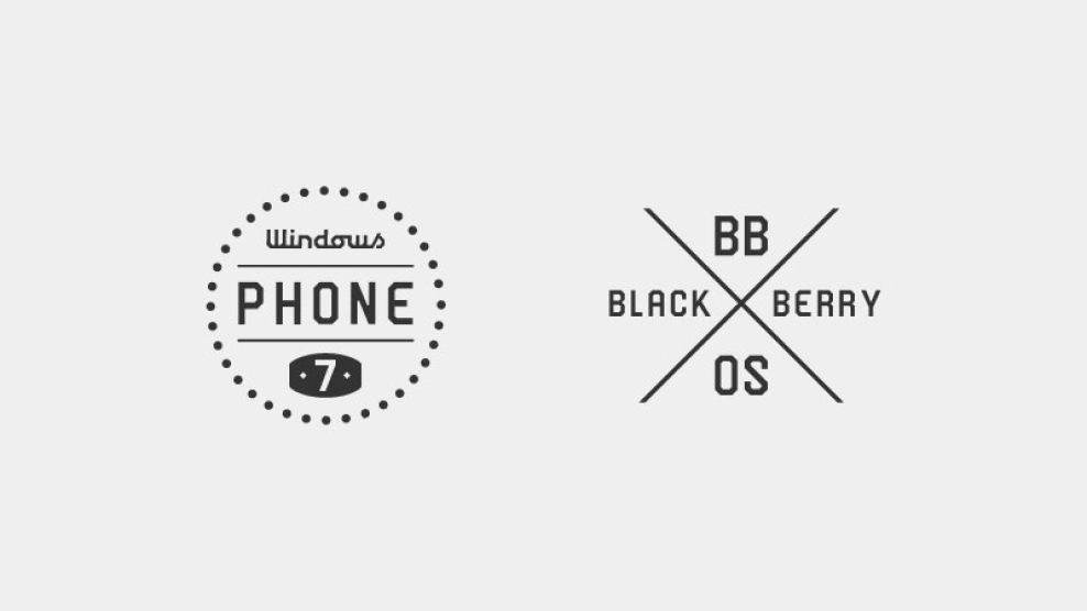
Starting with the logo, Socio Design penned several simplistic logos for Soap Industries to use. The main logo for the company takes the imaginative spin of a bar of soap, teasing at the way Soap Industries’ name comes across to those who do not know the purpose of the company. The remaining logos help the company separate mobile app products from one another based on what system the app is used on. For example, there are different logo designs for both Windows and Blackberry platforms.
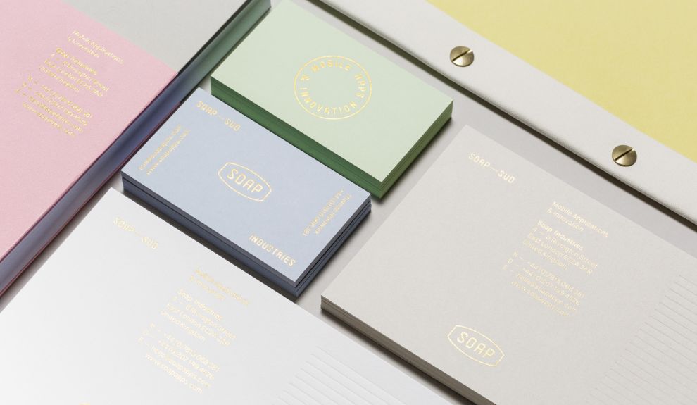
Falling back to a 1930s inspired insignia, Socio Design utilizes a creative combination of pastel colors and metallic foils to deliver a retro, old school design for Soap Industries. With pastel blue, green, pink, yellow, and off-white, Soap Industries’ business cards and stationery stand out in a world where vibrant colors are consistently used—especially for technology companies. The vintage set contradicts the modern day business Soap Industries runs in a way that is sure to intrigue anyone who sees it.

In addition to the metallic foil logo, Socio Designs also developed an embossed logo cleverly stating, “Made by Soap.” This logo looks as though it was created by a stamp on different pieces of stationery. This, along with the metallic logo, is used in a number of stationery pieces for the company. Each print design was mastered and perfected to complement the overall vintage feel of the company’s branding strategy.

Being a mobile app company, Soap Industries still maintains a strong online presence, so they required their vintage feel to be carried across multiple platforms. To do so, Socio Designs employed a vintage color scheme within their app, while bringing the golden logo into the platform. When users visit the site, they’ll be welcomed by a vintage and intriguing design that’s easy to explore. The simplistic and old school combination readily engages viewers, drawing them into the company’s offerings.
Soap is a minimalist print design in the Professional Services and Technology industries.


