
Hollister Co. is an American lifestyle clothing brand owned by Abercrombie & Fitch Co.
The concept was originally designed to attract consumers (ages 14 to 18) at a lower price point than the parent brand through its SoCal-inspired casual wear.
With a laid-back style, it focuses on one central theme for both girls and boys: The surf culture in Southern California.
The store launched in 2000 with its first brick-and-mortar location in Ohio. However, the label is branded as starting in California in 1922.
Leading fashion branding agencies consistently leverage the power of storytelling when conceiving prosperous brands.
Abercrombie & Fitch Co. created a faux backstory about a man named John Hollister, whom they say founded the label after settling in Laguna Beach in 1919.
As the story goes, the founder was a free-spirited Yale graduate who left Massachusetts in 1915. John turned down a comfortable life in Manhattan, instead setting sail for the Dutch East Indies.
He traveled through the South Pacific with his girlfriend before settling in California and opening a surfing store, which was then taken over by his son.
Despite the fake backstory, the name of the brand, Hollister, is also the name of a real town in California.
If you are looking for designers in this region, check out these leading California logo design agencies.

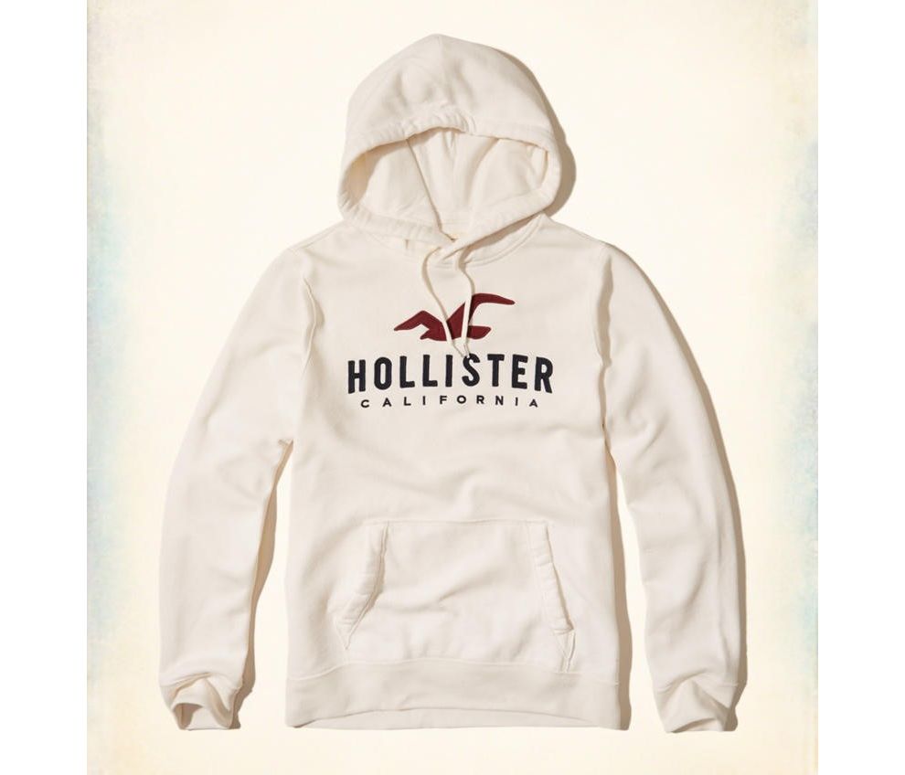
The Hollister logo is very thoughtfully designed, as it truly depicts the brand’s identity and origin.
The logo design includes a flying seagull, which is simple in design while remaining easily recognizable. Beneath the bird shape is the word “Hollister” in thick upper-case letters, followed by the word “California,” also in heavy upper-case letters.
The brand name is in a larger font size than the word "California," while the overarching shape of the seagull unites the design as a whole.
The logo is extremely adaptable and flexible but usually is seen in maroon. In fact, the maroon color found within the Hollister logo is often associated with joy, courage and strength, all of which are traits associated with the fictional John Hollister.
Other colors that have been featured in the logo are black and white, gray, and an array of pastel shades. The various color palettes maintain a classic look while also ensuring that the logo can be featured in many different designs.
Elements like the pop of maroon and the seagull shape ensure that the logo is appealing to a young market. It has a fun, vibrant and lively yet relaxed vibe, which is completely on-brand with the company’s identity.
The font is simple, yet provides instant recognition for the brand. It is easy to read and well-balanced, with a youthful and vibrant appeal. The logo also evokes a sense of heritage; this, combined with the other design elements, creates a very visually appealing design.
Hollister is a clean logo design in the Fashion & Beauty industry.


