
Hi-Pointe Drive-In’s Image-Focused Interface Leads Users On A Playful Journey
Hi-Pointe Drive-in is a hip and trendy burger restaurant located in St. Louis, Missouri. It’s owned and operated by a team of enthusiastic burger-lovers looking to transform the St. Louis foodie landscape and create a place for people to come together and spend time with one another.
And to promote this positive, cool and trendy vibe, the team went with a web design that is focused heavily on images — from headers to CTA boxes and everything in between.
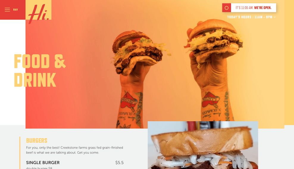
Landing on the website leads you to a webpage that’s made up of varying photographs of the products and the team. Above the fold is a bold photograph, that is given a fun, faded visual effect. Below are blocks of images that lead users to different areas of the site. These are also overlaid with an effect — either a fading pattern or a bright pop of color to help them stand out.
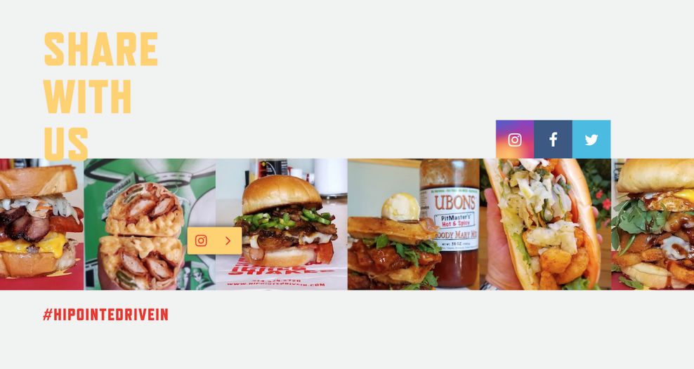
And each of the landing pages comes with an addition header image, followed by playful icons and a social media image integration that gives visitors a real-time look at what the brand has been up to and what it’s promoting across all mediums.
And it’s not just the emphasis on a photo-driven design that's of note, but the types of photos integrated as a whole.
These aren’t boring, corporate and dull images. They are cool. They are exciting. The people in them are obviously having a good time — having a food fight, telling jokes or enjoying a good burger.
This lightens the mood and helps users navigate throughout the site by giving them visually-driven content that they are compelled to engage with.
The Clever Pop-Out Menu Makes Navigation Simple
This is a simple website with only a few landing pages worth of information — the brand gives users a look into their story, their products and other valuable information for individuals and businesses alike.
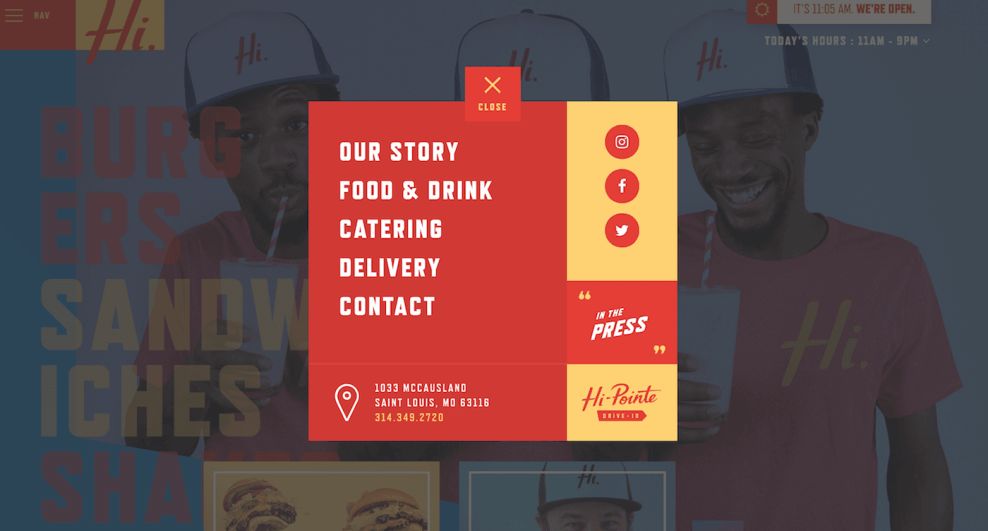
But one thing that really stands out is how easy it is to navigate the site — more appropriately, how easy the brand itself makes navigation thanks to its handy and intuitive tools. One of these tools includes the attention-grabbing pop-up menu that enters the screen once you click on the subtle hamburger menu or any of the CTAs at the bottom of the homepage.
This popup menu makes it clear the areas of the site users can interact with — whether they want to check out social media, learn more about the brand’s history or want to know how to contact them.
This creates a peaceful and engaging user experience. All it takes is a few clicks and users can access any and all of the information they need.
Bold typography and a clean organizational pattern matched with an intuitive and engaging pop-up menu make it fun for users to learn more about their new favorite burger joint.
A Simple Interface Gets A Modern Twist Thanks To Interactive Design Elements
The Hi-Pointe Drive-In is a fun and rambunctious brand that wants to push boundaries and make a statement. And it does so in its web design by infusing modern and interactive elements to grab attention and promote a dialogue between consumers and the brand.
These elements include an intuitive bar at the top right of the screen that gives the time, the weather and whether or not the restaurant is open. This, right off the bat, is a fantastic tool to integrate because it answers one of the first questions consumers likely have.
Additional interactive elements include the moving CTAs that shake and change color when you roll your mouse over. This, plus the pop-up menus that appear upon clicking on a CTA box or menu bar option makes for a dynamic and creative design that visitors can’t help but click through.
There is also a clever integration of social media — with the icons sitting on the homepage, on the pop-up menu and on landing pages, with images changing and adding context like what specials are available and what events are happening.
These are all innovative and modern elements that help shape the brand’s image and further simplify the laid-back web design.

Bold Colors And A Cool Aesthetic Give This Drive-In Restaurant Style
The image-driven layout of the website certainly packs a punch. It adds a playfulness to the brand and helps users navigate throughout the site. But there’s something to be said about the cool, hip and trendy vibes that radiate off of this website in waves. And that’s something that can’t be ignored.
This comes from the images, of course. Pictures of happy, laughing people is always a compelling design element. But it also comes from the overall tone, color choice and layout of the website.
The relaxed and cool layout of the website is simple and sensational. There are different sized boxes that move and shake as you mouse over that make up the bottom half of the homepage, with a faded and retro image making up the area above the fold. Match this with clever icons, interesting text boxes and pop-up menus, and you’ve got yourself a design that screams modernity.
And modernity is essential in design — it shows that a brand understands its audience and understands the world around it. And this modernity is evident from the start.
Using bright and bold reds, blues and yellows, this design demands to be seen and demands to be heard — much like the burgers the restaurant is promoting.
Similarly, each and every landing page holds this same persona — using a contrasting color scheme, dynamic design elements and bold typography, this website was created to be seen and it does everything in its power to connect with users on a personal, friendly level.

What Is Hi-Pointe Drive-In?
Hi-Pointe Drive-in is a former drive-in theater turned hip and modern burger joint. Located in St. Louis, Missouri, it’s a brand that works with locally-sourced ingredients to give its customers the best burgers, sandwiches and other mouthwatering menu items it has on its roster. It’s a self-aware brand that cares about the earth, sustainability and the well-being of its clients.
Here’s a message from the brand itself:
The Hi-Pointe has been an iconic St. Louis destination ever since this spot was a little drive-in in the 1980’s. Our mission is to bring it back to life with mouthwatering burgers and original sandwiches. Our chef-inspired menu uses locally sourced ingredients.Our burger and sandwich joint is located in the historic Hi-Pointe neighborhood, just off of highway 40. This spot is a great place to pop into before or after events around town, or even as the main event. The menu has something for folks of many walks of life from our creative burgers, sandwiches, and shakes, to healthy salads and a menu for the little ones. Following the tradition of killin' it, Hi-Pointe Drive-In is brought to you by your friends from Sugarfire Smokehouse, among a few of your other favorite eateries. See our full list of sister restaurants down below. Our team is made up of the greatest people we know and talented chefs that create a unique experience every single time you come in, order delivery, or cater your event.
Hi-Pointe Drive-In is a relatively new business, coming into creation in the last decade, and slowly changing the food landscape of St. Louis. It’s run by a team of enthusiastic and passionate professionals who love all things food and community.
And just by looking at their website, you can see that this is definitely an experience worth having if you’re in the St. Louis area.
Why The Hi-Pointe Drive-In Website Is Such A Success
The Hi-Pointe Drive-In website excels thanks to its overall cool and hip aesthetic. It’s a fun website that serves a purpose and delivers valuable information in a fun and retro format — enticing the inner burger-loving child in all of us.
It also includes a number of creative and interesting elements — social media integrations living in icons and images all across the site, fun pop-out menus and interactive and dynamic movement in the form of CTA boxes.
All of these elements come together to create a simple, easy-to-navigate website that displays its information clearly and prominently — fostering a user-friendly and pleasing experience.
Hi-Point Drive-In is a destination — it’s a community and a welcoming atmosphere where people can come together, hang out and enjoy good food. It’s a laid-back and relaxed brand that cares about its consumers and the experiences they have. And they want to infuse as much enthusiasm and excitement into their dining experience as possible so that people can feel comfortable and let loose.
This web design mirrors that personality from start to finish. Bold colors and exciting images pull you in, and the overall cool and clever layout gets you scrolling and clicking every which way. This is a brand that understands its audience and understands good website design.


