Minimalism Aligns The Fenty Beauty Brand As Modern And Chic
Fenty Beauty is a cosmetic brand founded by Rihanna. And it’s full of the same vivaciousness and energy that the famous singer is known for.
The Fenty Beauty brand is celebrated because of its inclusivity, and the simplicity of its packaging certainly opens the door for anyone and everyone to use it in a way that makes them feel beautiful.
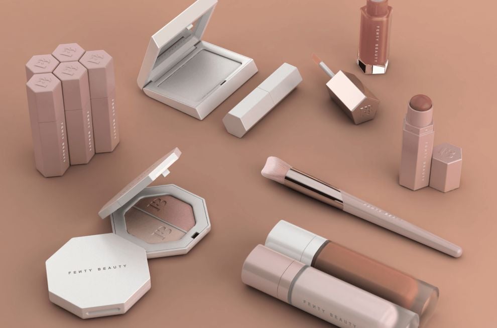
The Fenty Beauty brand makes use of minimal and chic aesthetics to create a product line that jumps from the shelves thanks to its elegance and delicate look and feel. From the soft pastels and whites to the matted creams and pinks — these products are soft, serene and inviting.
There’s also a matte coating around a lot of the lip glosses and powder sets that makes you want to reach out and run your fingers along them.
In most instances, the only notable element that stands out from these clean designs is the logo which is equally edgy and captivating. But the minimal nature here fosters a sense of wonder and curiosity.
Adept packaging design companies opt for minimalism as it showcases quiet confidence that more ornate and detailed do not possess. Minimalist design lets the product speak for itself, not to mention that it appeals to modern, millennial audiences. It’s a youthful design trend that captures simplicity, elegance and creativity. And in cosmetics, it lets people use their own imaginations and picture the makeup and it uses the way they want it to be used.
Minimalism is freeing and fun. And in this instance, it gives the Fenty Beauty brand a refined, classic and approachable identity.

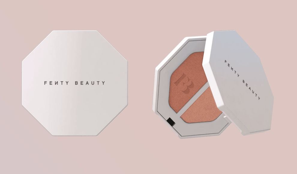
Clever Geometric Shapes Comprise The Fenty Beauty Packaging In A Way That Makes It Jump From The Shelves
Of course, what sits on a packaging can make it stand out. We’ve talked at length about the exciting use of colors, patterns and designs that makes packages fly off of the shelves.
But another interesting aspect of packaging design is shape. And Fenty Beauty plays with shape in a dazzling way.
The shapes that contain these cosmetics are very different than what you’d normally see in makeup packaging.
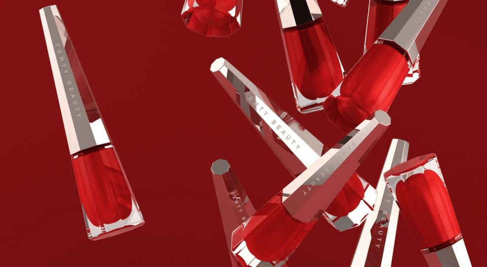
Starting with the lip glosses, these tubes are encased in a fun and flirty, octagonal and hexagonal shaping. The edgy and angular nature of this gives Fenty Beauty a modern, edgy and gritty nature that makes it cool and hip.
Fenty Beauty transcends traditional cosmetics. It is fashion and art combined. In this particular market, fashion branding professionals often pair products with the iconic figure, be it an influencer or genuine celebrity. Fenty, however, directly embodies Rihanna's signature style.
And it embodies the personality of Rihanna herself. She dares to be different, pushes boundaries and takes risks. And so do these cosmetics.
The powder pallets are also created in a geometric shape, as are the nail polish containers. The shapes vary, but they are all sharp, angular and pointed to show that they have a fierceness. And you can have that ferocity too if you take these products home.

Fenty Beauty’s Iconic Logo Is A Distinguishing Design Element In These Packaging Designs
One of the most notable aspects of these beauty designs is the logo that sits as the main design element across products. And it’s not just the use as a concept that is exciting, but the actual logo itself.
The Fenty Beauty logo comes in two forms — a monogram and a wordmark. In the wordmark, the clean, sans-serif and capitalized letters give off an authority and a mastery. And the clever way the N sits in reverse jumps out at you. This is modern and cool — much like the brand itself.
But in its monogram form, the F and B mesh together in a sophisticated and fluid way. But there’s also a sharpness to the way the pointed edges of these letters meet in the middle. It’s bold and brash and right up in your face.
Using logos as the main focal point in a design can be a great way to promote brand identity and keep your designs simple. They also add a uniqueness and a simplicity that is becoming more and more appealing.
This shows that the brand is in-tune with the times and the market. And it will continue to be for years to come.

Fenty Beauty’s Packaging Design Balances Soft And Edgy Elements
All of these design elements combine to create a packaging that is both soft and sharp. It’s edgy yet delicate. It’s in your face yet refined.
It walks the perfect line between being fierce and unrelenting and laid back and sophisticated.
And we can’t get enough.
The softness comes from the pastels, matte coating and delicate aesthetic. The edginess comes from the graffiti print, the sharp lines and the bold angles.
These two themes work together in this design, sitting side by side even on the same product. And it creates a certain discrepancy in the mind.
Sometimes this paradoxical thinking can be confusing and jarring. But in this design, it brings the whole thing together and gives the brand a personality and an essence that makes it more popular.
What Is Fenty Beauty?
Fenty Beauty is a cosmetics brand created by singer Rihanna in 2017. This fresh and exciting new makeup line showcases a variety of different shades and color so as to appeal to all makeup wearers.
Rihanna grew up with a passion for makeup, and was frustrated by the lack of representation in the industry not just in advertising, but in the makeup themselves. That’s part of the reason she set out to create a line of products in 40 different shades so that everyone could find their color fit.
These foundations, as well as the entire makeup collection itself, promotes diversity and inclusivity. And it won Rihanna a shoutout from Time magazine who named the iconic foundation line Pro Filt'R one of the best innovations of the year.
According to the brand:
Before she was BadGalRiRi: music, fashion and beauty icon, Robyn Rihanna Fenty was a little girl in Barbados transfixed by her mother’s lipstick. The first time she experienced makeup for herself, she never looked back. Makeup became her weapon of choice for self-expression—a way to radiate her ever-changing mood—and it powered a fearless take on beauty that helped her become the boundary-breaking icon she is today. Rihanna was inspired to create Fenty Beauty after years of experimenting with the best-of-the-best in beauty—and still seeing a void in the industry for products that performed across all skin types and tones. She launched a makeup line “so that women everywhere would be included,” focusing on a wide range of traditionally hard-to-match skin tones, creating formulas that work for all skin types, and pinpointing universal shades.
Of course, this brand gained notoriety because of its celebrity influence. But there are a number of other brands that have celebrities tied to them that aren’t nearly as successful.
Fenty Beauty stands out from the rest because of the passion and the dedication you can see was put into it. There was a care and a love and a devotion and that comes from the founder herself.
And the progressive nature of these products also helps it appeal to a much wider audience, securing its success for years to come.
This packaging helps to elevate these goals and this brand as a whole, aligning it as a modern innovator poised for success.
The Power Behind The Stunning Packaging Design
The Fenty Beauty products are powerful thanks to their message of inclusivity and diversity. These products can and should be used by everyone. And they were created with a love and a passion that is lacking in the industry today.
And the packaging mimics this robust backbone in a variety of ways.
For starters, this packaging is equal parts feminine and edgy. It has a softness and a delicate nature in the soft pastels and whites, matched with the almost textured, matte coating that lines a lot of these designs.
But at the same time, there’s an edginess that comes from the geometric shaping, harsh lines, metallic colors and gritty, graffiti typography.
But the two themes work together beautifully to create a makeup brand that is captivating and sophisticated.
In addition to these obvious design elements, the logo sits as a focal point that draws the eyes in and brings context and clarity to the brand. The logo is modern and fun, with a backward-sitting N that stands at attention and demands to be seen.
Overall, these designs are minimal and clean, drawing on a modern and millennial aesthetic that has been known to sell quite well. This brand wants to align itself as one that is inclusive, one that cares. But it also wants to be youthful, fun and playful. And this packaging captures that essence beautifully.
The logo binds these designs together, while the mixture of softness and sharpness creates a discrepancy that is pleasing and intriguing. Each piece of makeup, each line comes with its own identity that you yourself can mirror and relate to.
And it helps these products fly off the shelves in amazing ways.


