- Home
- Best Designs
- Best Logo Designs
- Brewster Murray
- Advertising
- Aerospace
- Agriculture
- Architecture
- Arts & Recreation
- Automotive
- Banking & Finance
- Content & News
- Distribution
- E-Commerce & Retail
- Education
- Engineering
- Entertainment
- Fashion & Beauty
- Food & Beverage
- Government
- Health & Wellness
- Hospitality
- Legal & Insurance
- Luxury
- Manufacturing
- Medical & Pharmacy
- Non-Profit
- Professional Services
- Real Estate
- Sports & Leisure
- Technology
- Travel

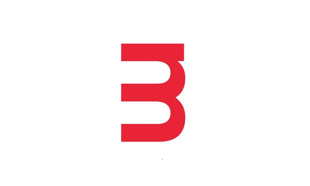
Brewster Murray’s logo is a playful manipulation of the company’s monogram. The lowercase ‘M’ is on it side and represents the word Murray and the white space outlines the 'B' in the company's name. It's helvetica font draws attention to the balanced line of symmetry, and isn't cluttered with illustrations. The color is interchangeable and at times the company has replaced it with a classic white.

Overall, the designer did an excellent job capturing Brewster Murray’s contemporary flair. The logo design pops off the page, making the company's brand marketable.
Brewster Murray is a minimal logo design in the architecture and engineering industry.
More Best Architecture Logo Designs
More Best Engineering Logo Designs
More Best Professional Services Logo Designs
Sign Up for Our Newsletter
Receive the Latest Digital Trends &


