- Home
- Best Designs
- Best Logo Designs
- Bike New York
- Advertising
- Aerospace
- Agriculture
- Architecture
- Arts & Recreation
- Automotive
- Banking & Finance
- Content & News
- Distribution
- E-Commerce & Retail
- Education
- Engineering
- Entertainment
- Fashion & Beauty
- Food & Beverage
- Government
- Health & Wellness
- Hospitality
- Legal & Insurance
- Luxury
- Manufacturing
- Medical & Pharmacy
- Non-Profit
- Professional Services
- Real Estate
- Sports & Leisure
- Technology
- Travel

Typography In Bike New York’s Logo Resonates With The City’s Growing Biking Culture
Bike New York is a non-profit organization that promotes biking as a healthy and sustainable form of transportation and offers bike-sharing program in NYC’s extensive biking network.
Their logo, along with other brand identity elements including their website and brochures, was designed by Pentagram.
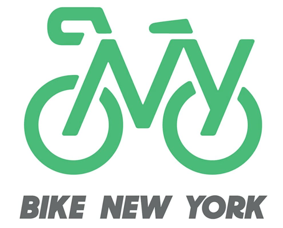
The logo is a simple vector representation of a bike: the twist is, “NY” forms the bike frame, incorporating the city’s identity into a user-friendly and familiar image.
This effective “2 in 1” solution raises Bike New York’s profile as one of the city’s defining public services. The fact that the “NY’ in the logo is slanted to the right lends a fitting touch of dynamism.
The creators of the logo state that it is “instantly recognizable and also remarkably easy to draw, so anyone can make it their own,” which resulted in numerous personal reproductions of the official logo on Bike New York’s website.

The Logo’s Green Color Promotes Eco-Friendly Values And Embodies The Health-Conscious Mindset Of Many New Yorkers
Pentagram’s entire visual identity package for Bike New York uses multiple colors, such as orange, grey, yellow and sky blue, each symbolizing an aspect of street bike riding.
The logo, however, is all green. The green hue is not there by chance: this color signifies the exact same shade of New York City’s bike lanes.
Green has, for obvious associative reasons, long been the color of ecologically minded movements and a healthy lifestyle. Exactly the type of values biking stands for.
For surfaces where the green color would clash with other colors or be unnoticeable, the alternate version of the logo uses white.

The Simple Design Of Bike New York’s Logo Captures The Essence Of Movement And Community
Pentagram states that “inspired by the straightforward visual icons of street signage, the letter-based logo is composed of stencil-like shapes that literally illustrate the organization’s name.”
The simple design also makes the logo very easy to understand, adopt and implement into the memory of bike-riding millions.
Logo is a key component of any brand’s visual identity. It is the first thing potential and existing customers see when coming into contact with a brand and it sublimates all of its core values into a single image.
The biking community is a passionate one and has a strong sense of belonging to a city that has given them a network of biking routes. Bike New York’s logo commands this feeling of togetherness through a sense of movement with its relatable and all-encompassing image.
Despite condensing several messages into a single logo, the image itself is remarkably simple: a few vector lines, with no 3D perspective or any excessive shading is an exercise in minimalism.

The Accessibility Of Bike New York's Logo Makes It Applicable To Advertising Campaigns, Digital And Print Environments
The logo’s Sharp Sans typography allows for reconfiguration of the copy so that the entire logo and the elements that make it – bike and New York – can be applied to various means of messaging.
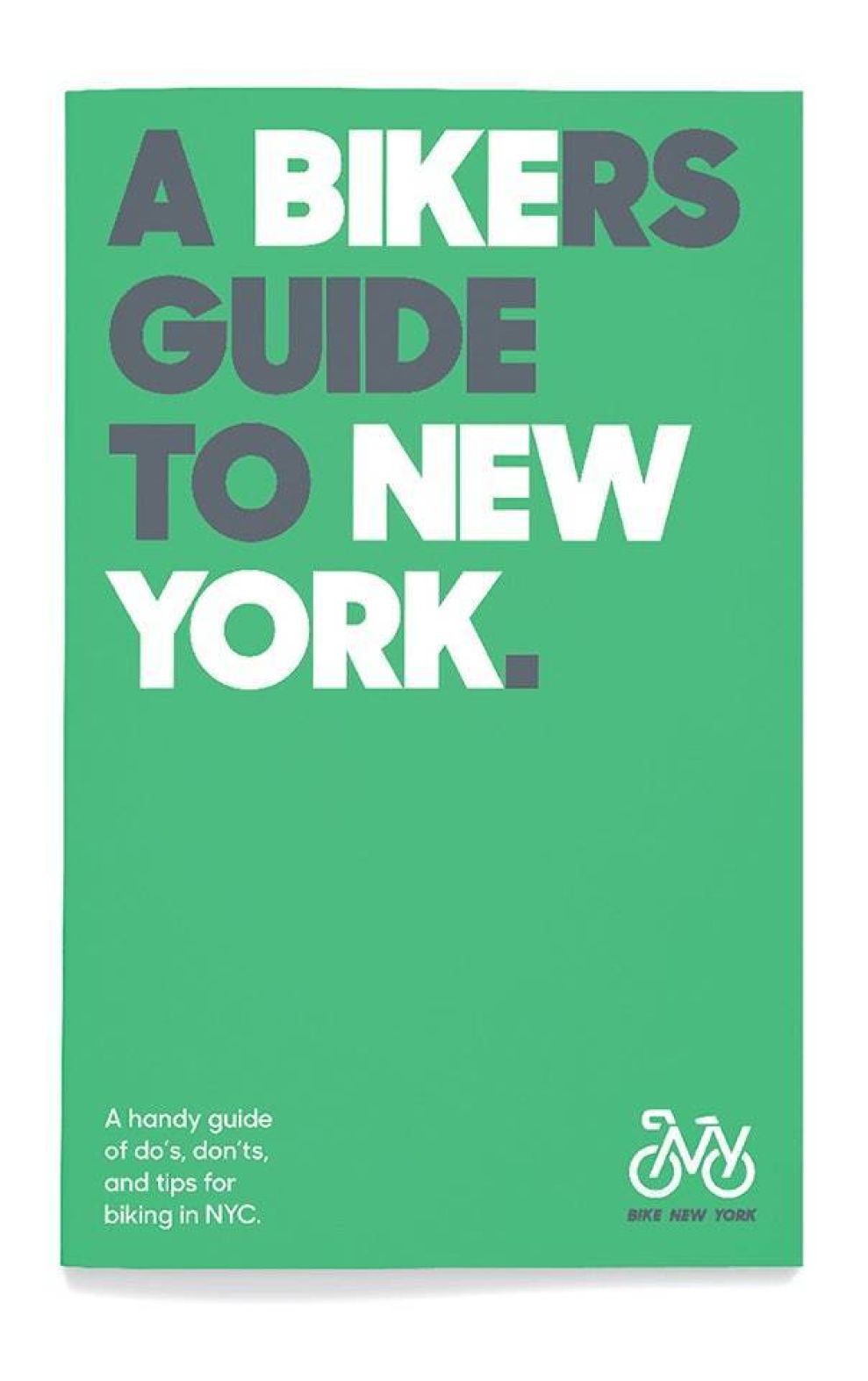
Some of these means include Bike New York’s website – both mobile and desktop - riders’ guides, map of bike lanes, Bike Expo New York posters, advertising features and apparel.
All of these different mediums incorporate Bike New York logo.
The simplicity and directness of the logo make it highly versatile in its applications across a wide range of different environments.
The eye-catching design immerses the viewer in a way that feels personal and generally inclusive at the same time.

Bike New York’s Bold Logo Stands For Sustainable And Practical Transportation And Reflects Biking’s Growing Popularity In NYC
Bike New York’s extensive web of actions, initiatives and events transcends the organization’s original and primary purpose of gathering bike enthusiasts under one roof.
Their impact is transformative and, as such, they do a whole lot of good for the greater New York community.
The organization's About page puts it the best:
“Bike New York empowers New Yorkers to transform their lives and their communities through bicycling. Our vision is to increase ridership, to empower youth to lead healthy, productive lives, to remove barriers to cycling, and to advocate for and expand services to reach more New Yorkers.
We offer free bike education programs throughout the five boroughs, whereby we teach kids and adults how to ride a bike, and how to do so safely and confidently in the city. […] Bike New York organizes numerous annual events, including the TD Five Boro Bike Tour (the largest charitable bike ride in the U.S.), Bike Expo New York, and smaller regional and community rides.”
Embracing the modern-day values of inclusivity, diversity and sustainability, the organization required a logo that would be all-encompassing and universal, yet proudly local.
The end-result of Pentagram’s effort was radically different to the organization’s previous logo. A much more simplified, stripped-down and streamlined design captures the key messaging points without needless distractions.
Oozing creativity and a go-getter attitude, Bike New York’s logo is a bullseye representation of the organization’s commitment to New Yorkers’ well-being while staying true to the brand’s identity.
If you are looking for designers in this region, check out our list of the best New York logo design companies.
- Industries:Arts & Recreation Health & Wellness Non-Profit Sports & Leisure
- Tags:Logo symbols Typography


